Badges are concise, non-interactive labels that represent metadata.
Usage
When to use
- To indicate status, such as “Running”, “Applied”, “Errored”, etc.
- As feature flags, such as “In Preview”, “Beta”, “New”, etc.
- For categorizations, such as Product Lines and Account Levels.
- For keyboard shortcut hints, such as “Esc”.
When not to use
- To display version numbers or collection counts in Tabs, use BadgeCount
- For a list of metadata elements (like selected filters), consider using a Tag.
- For dismissable elements, consider using a Tag.
- For longer status messages, consider an Alert.
- Don’t use a link within a Badge, consider moving the link outside of the Badge.
Related
Color
There are six colors: neutral, neutral-dark-mode, highlight, critical, success, and warning.
Use color logically.
- Neutral to call attention to general metadata, such as "New", "Beta", "In Preview", etc.
- Neutral (dark mode) for general metadata on dark backgrounds, such as sidebars and headers.
- Highlight for general metadata that needs a more obvious callout or prominence on the page.
- Success to indicate a successful or passive action, such as "Running".
- Warning to indicate a warning.
- Critical to indicate critical feedback or something that needs immediate action.
Icon
An icon can be shown in addition to or instead of text.
Badges come in a few icon and text combinations; text only, icon only, and icon + text (where icons are always on the left). Use icons intentionally and only when they provide the user with extra value.
Size
There are three sizes: small, medium, and large.
Medium* is the preferred size, but use a badge size that best fits the UI.
For example:
- use large badges when inline with a heading
- don’t use large badges in tables
As badge widths need to get smaller (ie. for a responsive input), the content within the badge may truncate.
Type
There are three types of Badges: filled, inverted, and outlined.
Use Filled badges when displaying many badges at once or to make subtle callouts.
For example:
- when listing statuses in a table
- for successful or passive actions
Use Inverted when needing to draw extra attentio nto somthing. Use intentionally and sparingly.
For example:
- for errors or other critical feedback that needs addressing
- when needing many badges on one page take care not to overwhelm the user with too many inverted badges.
Use Outlined as an alternative to Filled, but when extra attention is not required.
Content
- Labels should be short and to the point (~25 characters). They should not consist of full sentences, but should provide enough context to be useful, especially when using status badges.
- Language should be used consistently within each product (ie. when using “In Progress” for 1 badge, use that same convention throughout the rest of the application).
- As badge widths need to get smaller (ie. for a responsive layout), the content within the badge may truncate.
Accessibility
Status badges (Success, Warning, Critical) should always include an icon to avoid relying on color alone as a means to indicate status to the user.
When using badges, provide annotations of the non-visual experience to the team. This could look like:

How to use
Basic
For a neutral text-based Badge, just pass in text.
<Hds::Badge @text="Simple badge" />
Color
The color argument can be used to change the color from the default neutral value.
<Hds::Badge @text="Success badge" @color="success" />
Icon
Use the icon argument to pass in the name of an icon to be displayed to the left of text.
<Hds::Badge @text="With text" @icon="terraform" />
isIconOnly
To display an icon without text set the isIconOnly argument to true. Text is still necessary for accessibility but it won’t be displayed visually.
<Hds::Badge @text="With text" @icon="terraform" @isIconOnly= />
Size
A different size of Badge can be invoked using the size argument.
<Hds::Badge @text="Large badge" @size="large" />
Type
Use the type argument to invoke different Badge types.
<Hds::Badge @text="Outlined badge" @type="outlined" />
Component API
- Name
-
size - Type
-
enum - Values
-
- small
- medium (default)
- large
- Name
-
type - Type
-
enum - Values
-
- filled (default)
- inverted
- outlined
- Name
-
color - Type
-
enum - Values
-
- neutral (default)
- neutral-dark-mode
- highlight
- critical
- success
- warning
- Name
-
text - Type
-
string - Description
-
The text of the badge or value of the screen-reader only element if
isIconOnlyis set totrue. If no text value is defined an error will be thrown.
- Name
-
icon - Type
-
string - Description
- Use this parameter to show an icon. Any icon name is acceptable.
- Name
-
isIconOnly - Type
-
boolean - Values
-
- false (default)
- true
- Description
- This indicates if the button will only contain an icon. An internal check is in place to ensure that accessible text is still applied to the component.
- Name
-
…attributes - Description
-
This component supports use of
...attributes.
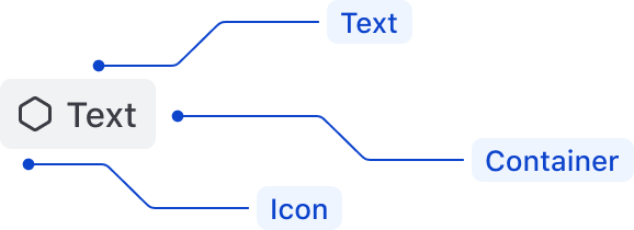
Anatomy

| Element | Usage |
|---|---|
| Text | Required |
| Color | Optional |
| Icon | Optional, but required on Status badges (Success, Warning, Critical) |
| isIconOnly | Optional |
| Size | Optional |
| Type | Optional |
Conformance rating
When used as recommended, there should not be any accessibility issues with this component.
Support
If any accessibility issues have been found within this component, please let us know by submitting an issue.